Logo designs commissioned by OAKHOUSE, a Japanese shared house company, worked on logos for customer acquisition projects and new properties.
OAKHOUSE BOYS/GIRLS
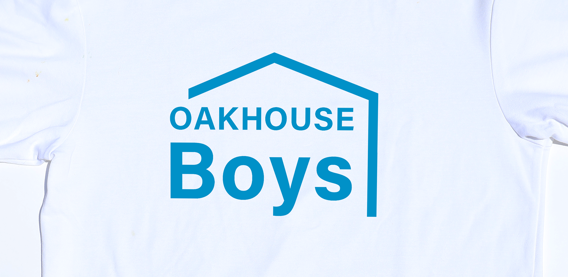
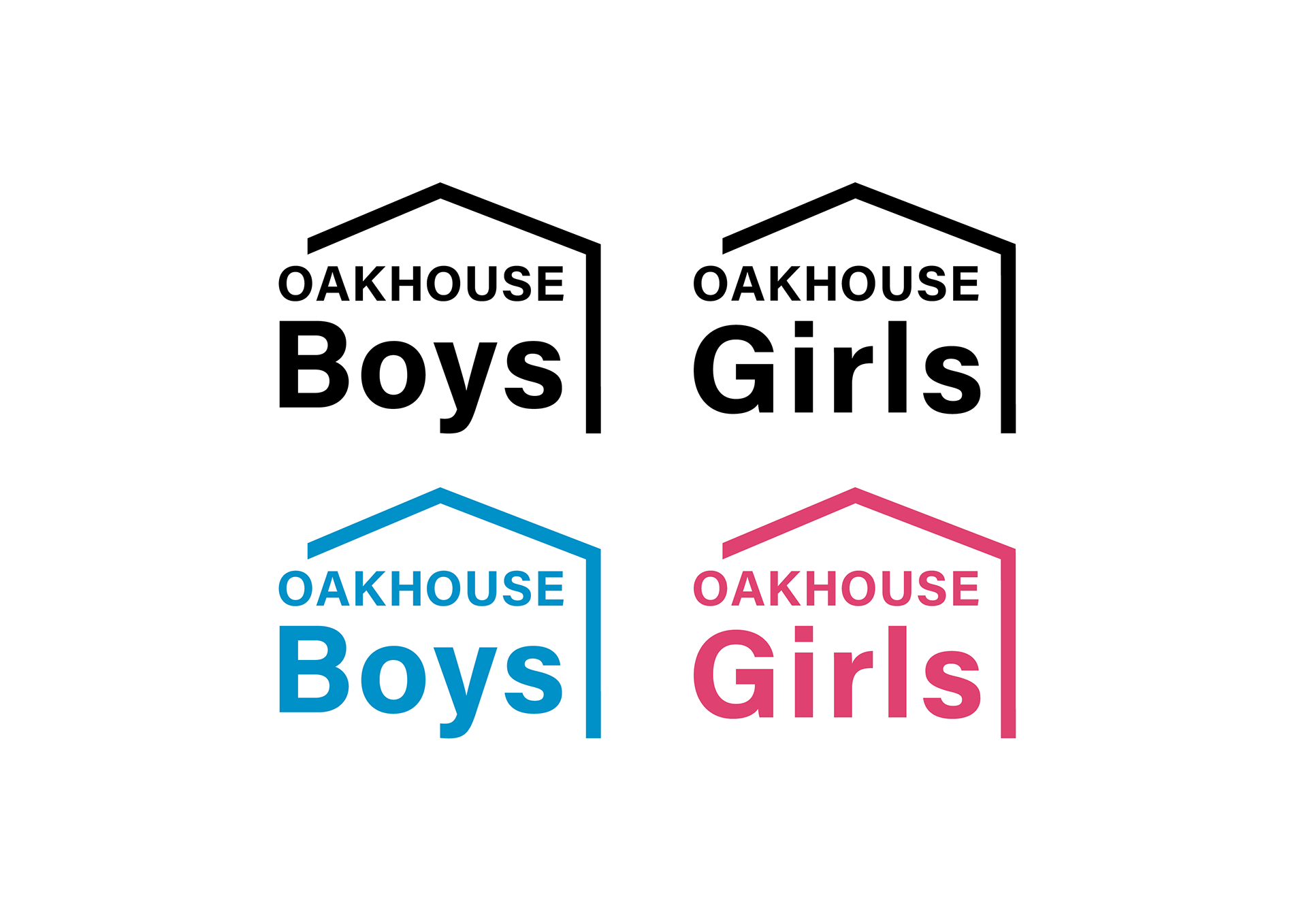
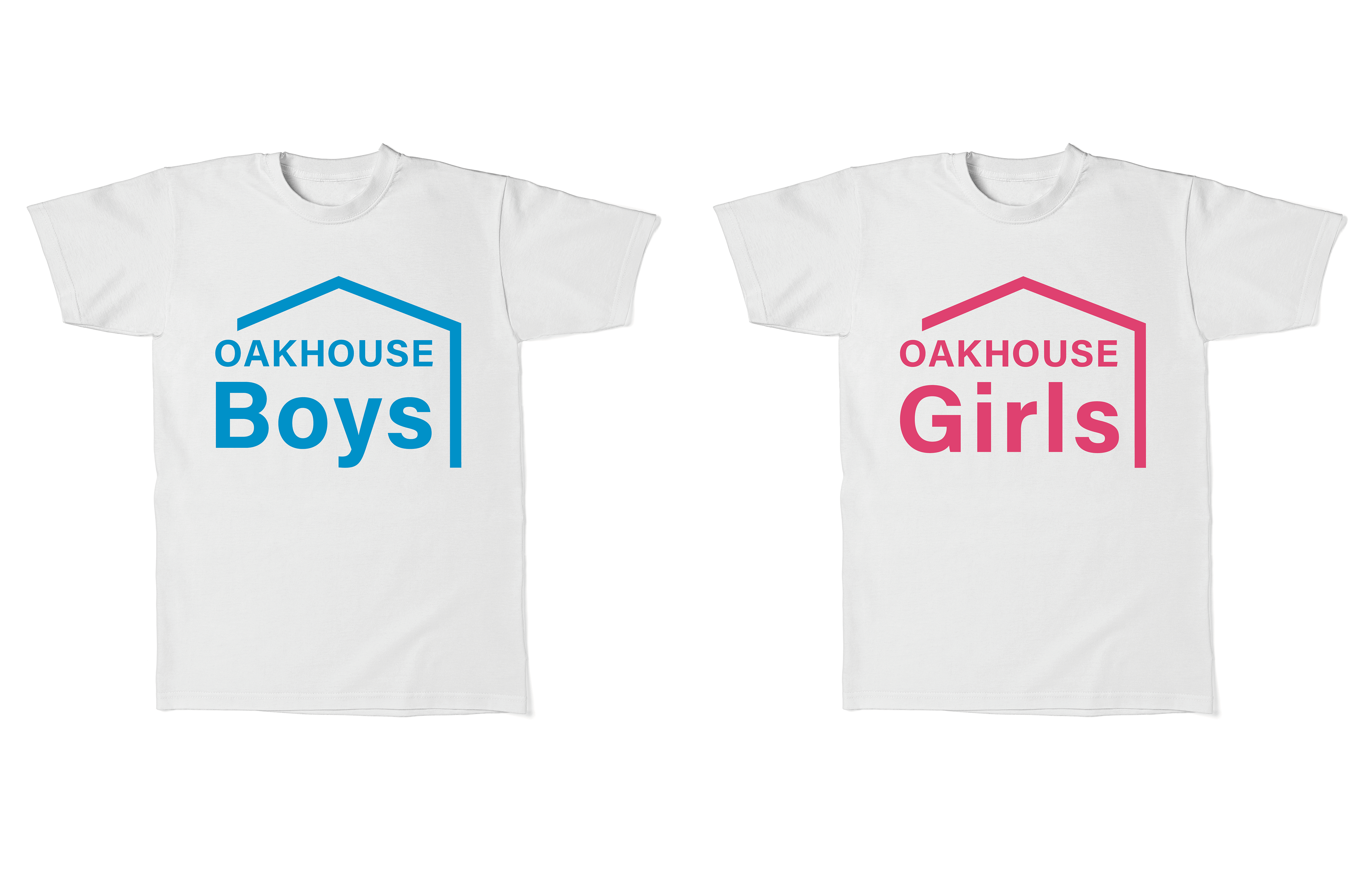
I designed the logo for "OAKHOUSE Boys/Girls," a project by OAKHOUSE, Japan's largest sharehouse company. The project lets residents help with house renovations in exchange for partial rent discounts, speeding up renovations and solving labor shortages.
CONCEPT
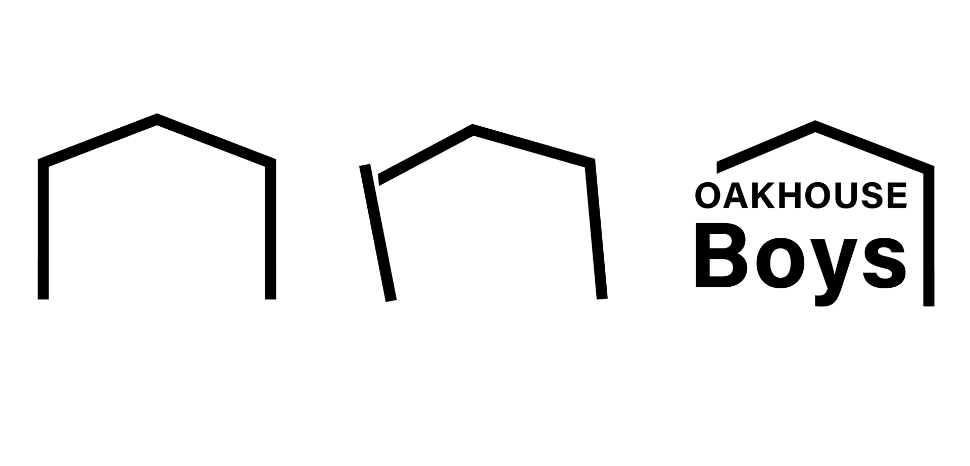
Visualized the scene of project staff helping in houses needing repair. It represents how each staff member functions as a pillar supporting the house.

PROCESS
Ideation
Since the client primarily requested a logotype-only symbol, I began by exploring various typefaces. I then categorized the created typefaces into several groups.
Since the client primarily requested a logotype-only symbol, I began by exploring various typefaces. I then categorized the created typefaces into several groups.
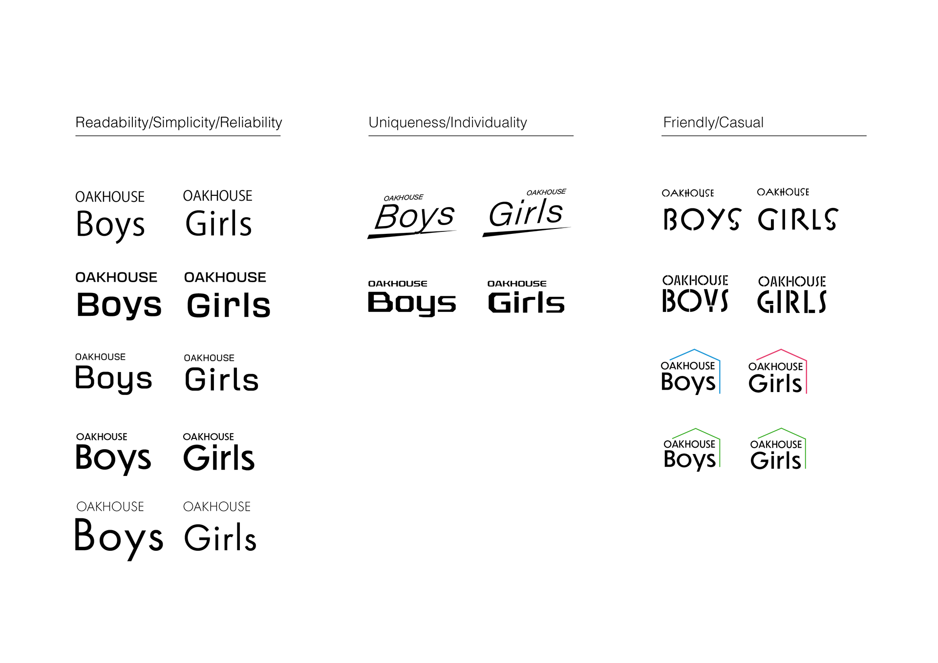
Logo Proposal
As the initial proposal, I submitted four options, each with a distinct image.
As the initial proposal, I submitted four options, each with a distinct image.

Revised Proposal
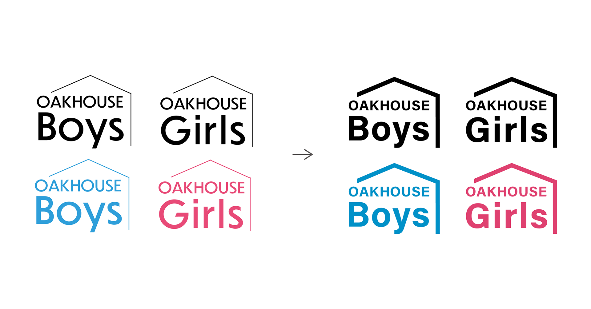
Based on the client's feedback, Option 04 was selected. The client requested a stronger visual impact for the logo, so I thickened the lines overall to create a more bold and powerful impression.
Based on the client's feedback, Option 04 was selected. The client requested a stronger visual impact for the logo, so I thickened the lines overall to create a more bold and powerful impression.

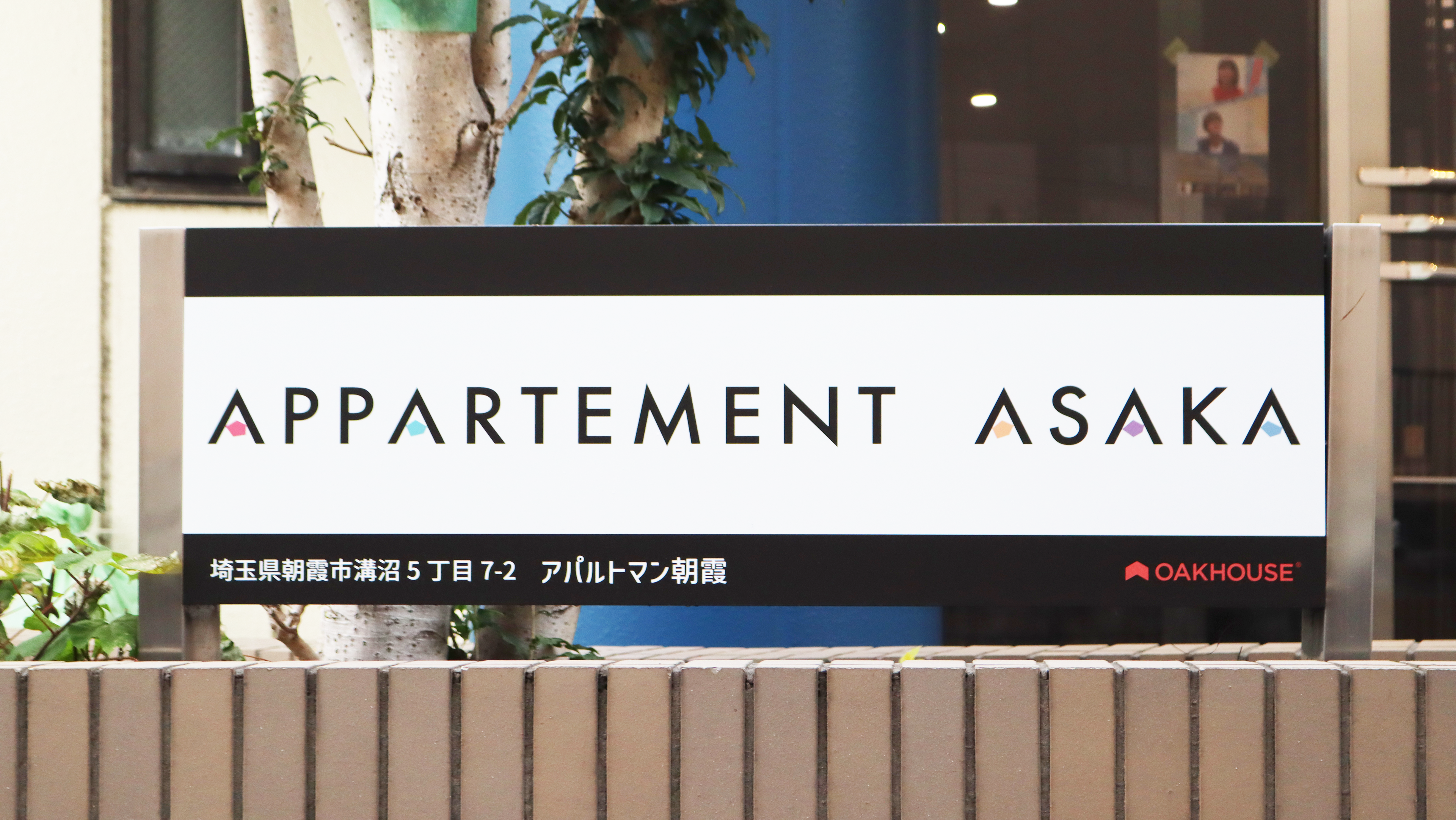
APPARTEMENT ASAKA
I created the logo design for a new apartment building by OAK HOUSE, a Japanese shared housing company.

CONCEPT
"A Playground for Adults"
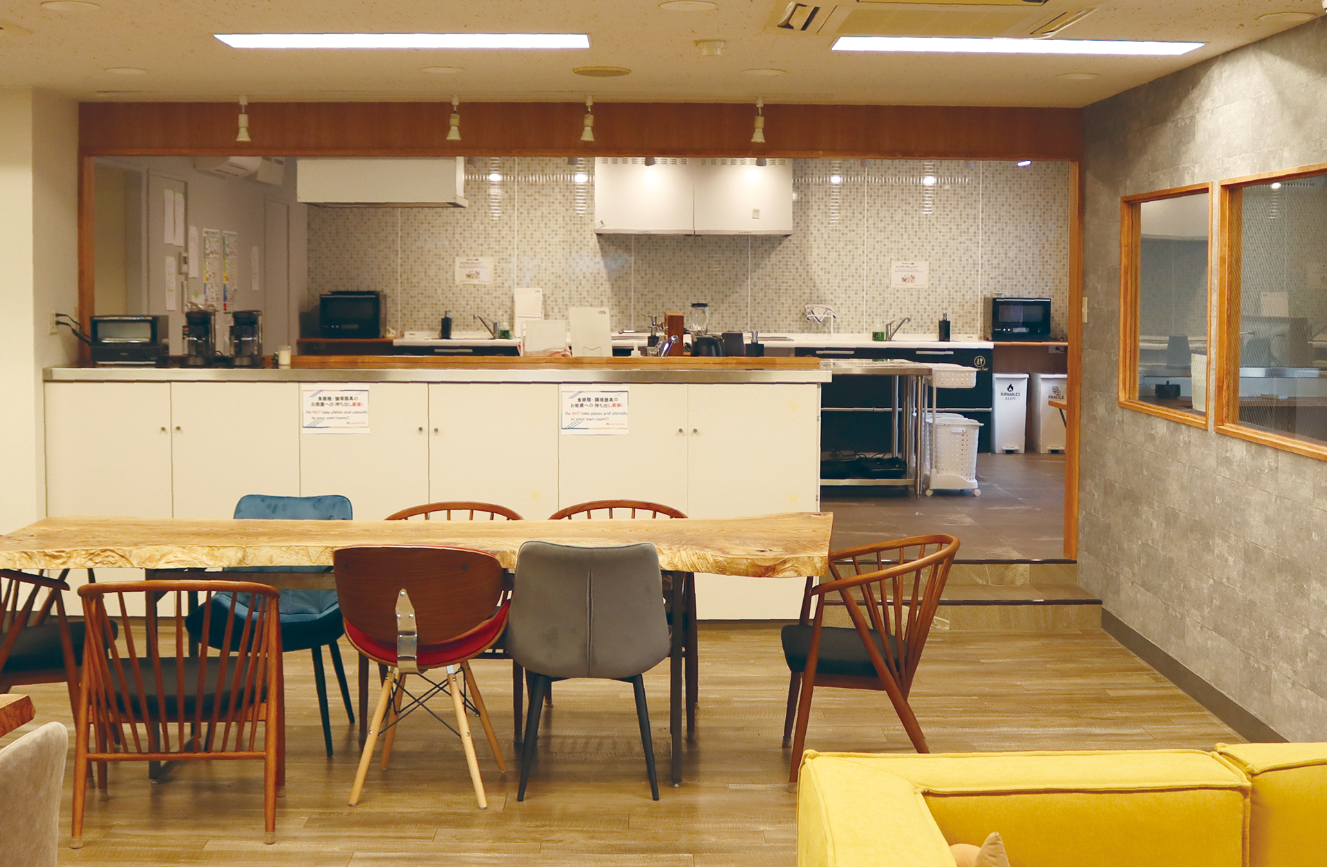
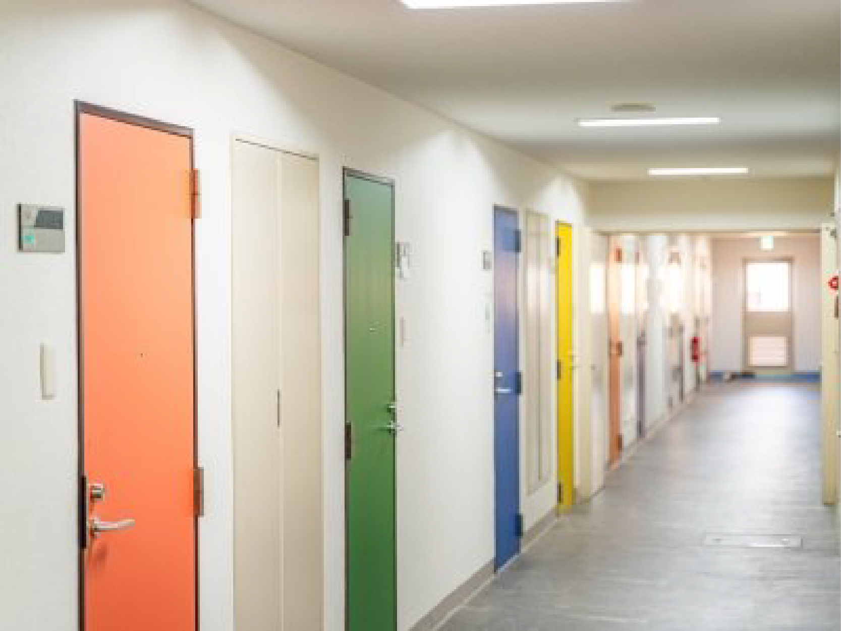
Through the various recreational spaces within the property, I aim to foster deeper connections within the community. Unlike traditional apartment complexes where all rooms have the same design, each unit in this property, including the entrance doors, features a unique design. By allowing residents to express their individuality and values through their living spaces, I hope to create opportunities for building a vibrant and inclusive community.
Through the various recreational spaces within the property, I aim to foster deeper connections within the community. Unlike traditional apartment complexes where all rooms have the same design, each unit in this property, including the entrance doors, features a unique design. By allowing residents to express their individuality and values through their living spaces, I hope to create opportunities for building a vibrant and inclusive community.
Ideation
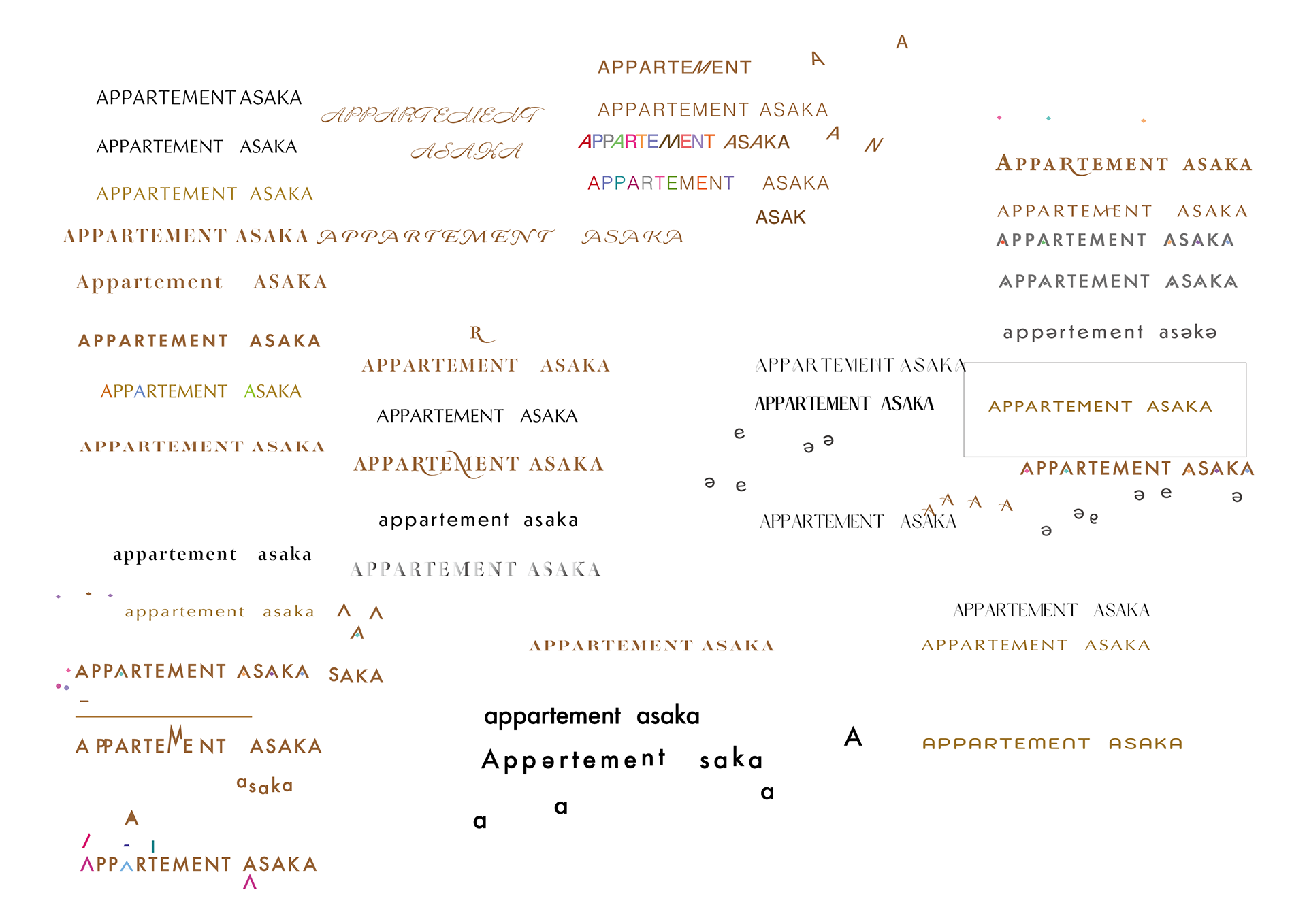
The client provided the concept of "A Playground for Adults," so I focused on typefaces that convey a sense of sophistication and luxury.
The client provided the concept of "A Playground for Adults," so I focused on typefaces that convey a sense of sophistication and luxury.
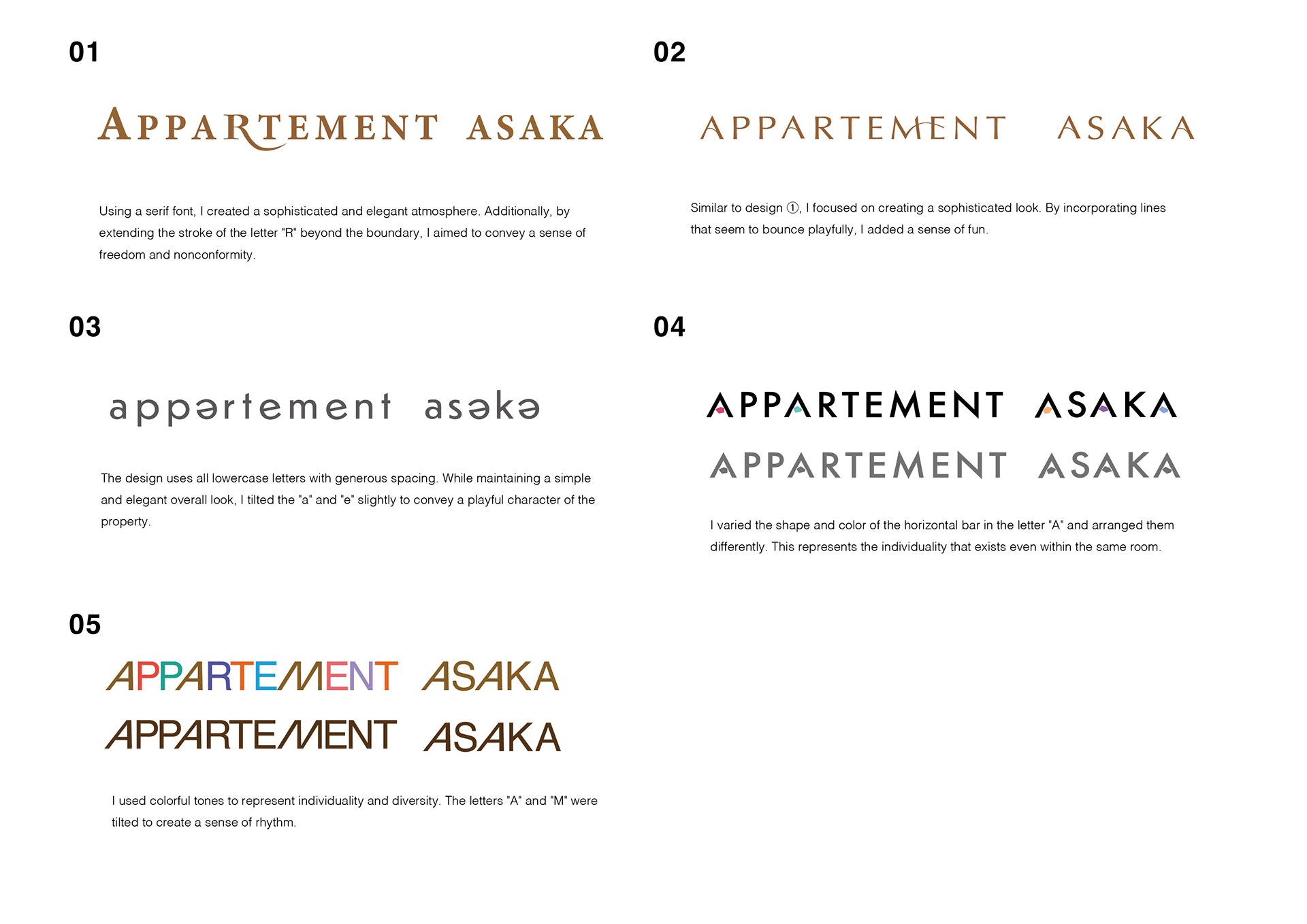
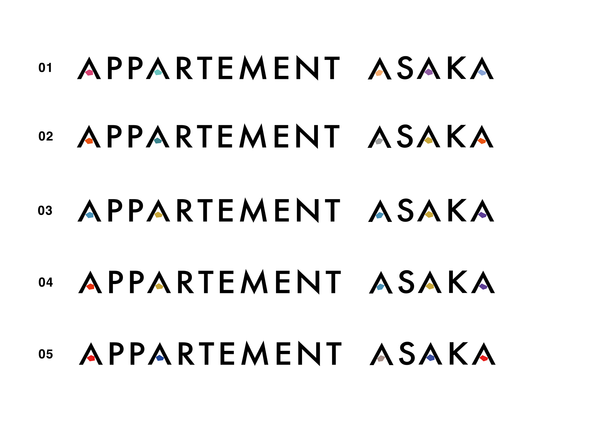
Logo Proposal
Color Exploration
Once the logo design was finalized, I moved on to color selection. After exploring combinations with the main typeface, the decision was made to go with Option 01, which gives an initially colorful impression.
Once the logo design was finalized, I moved on to color selection. After exploring combinations with the main typeface, the decision was made to go with Option 01, which gives an initially colorful impression.
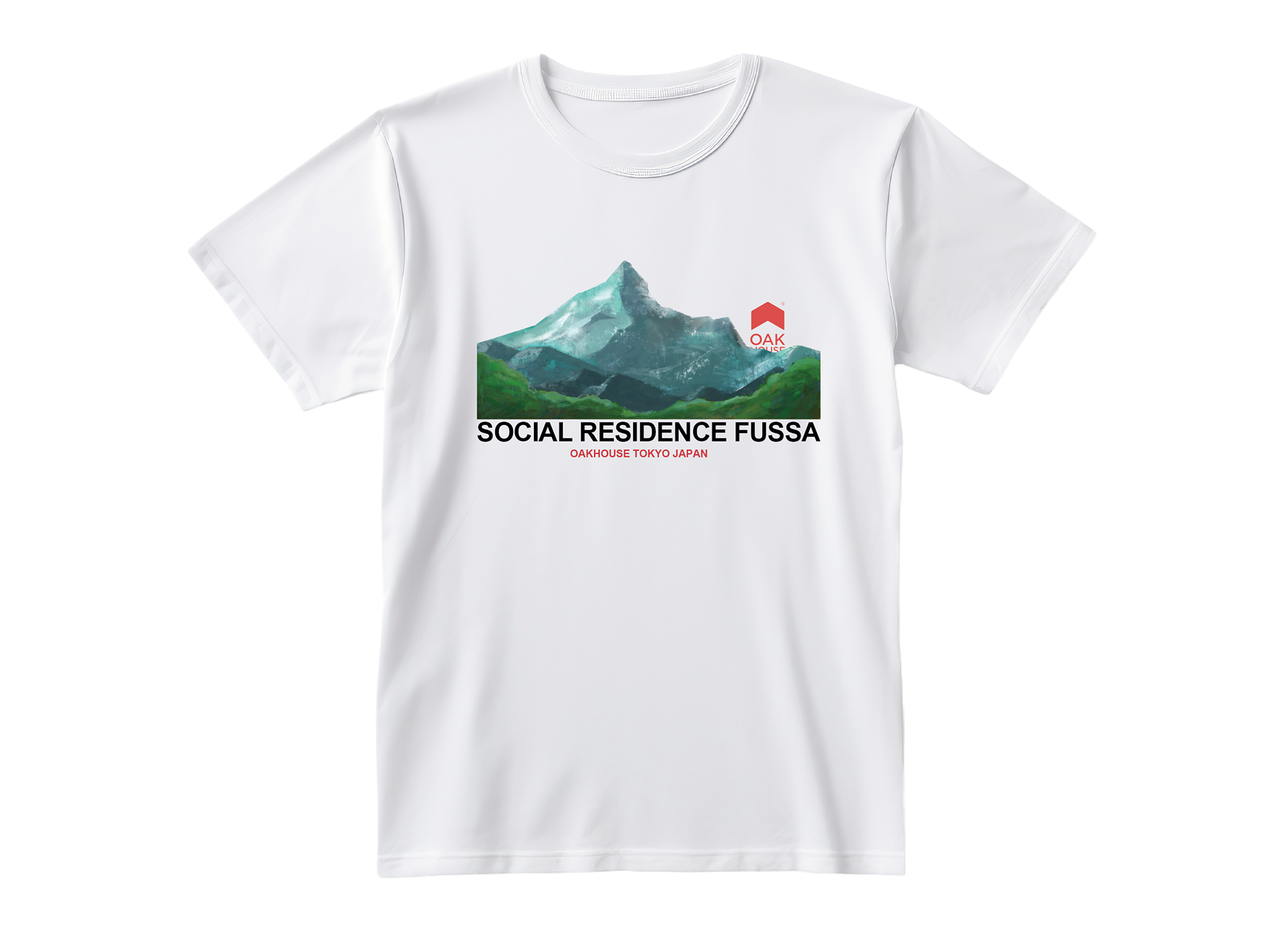
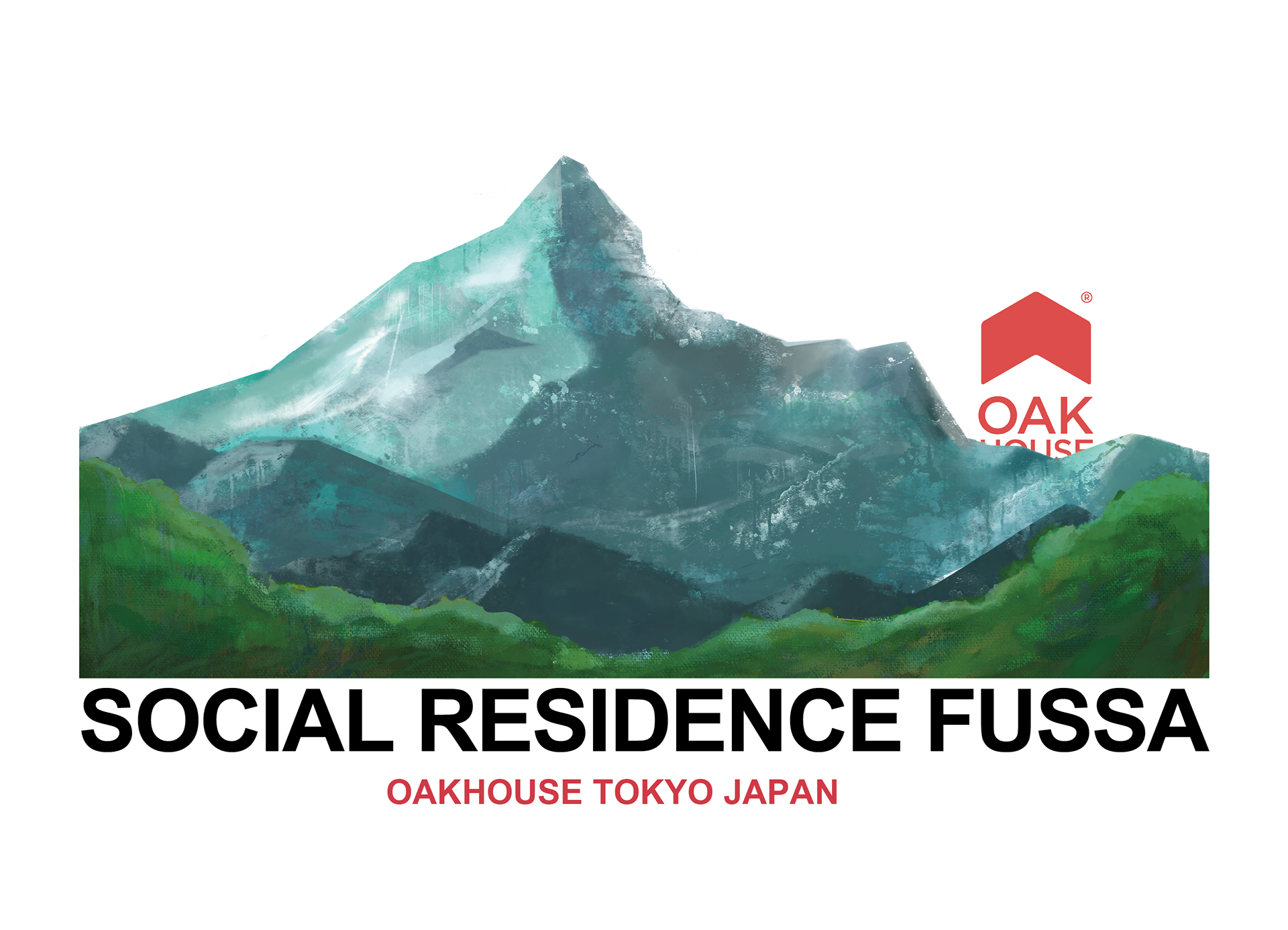
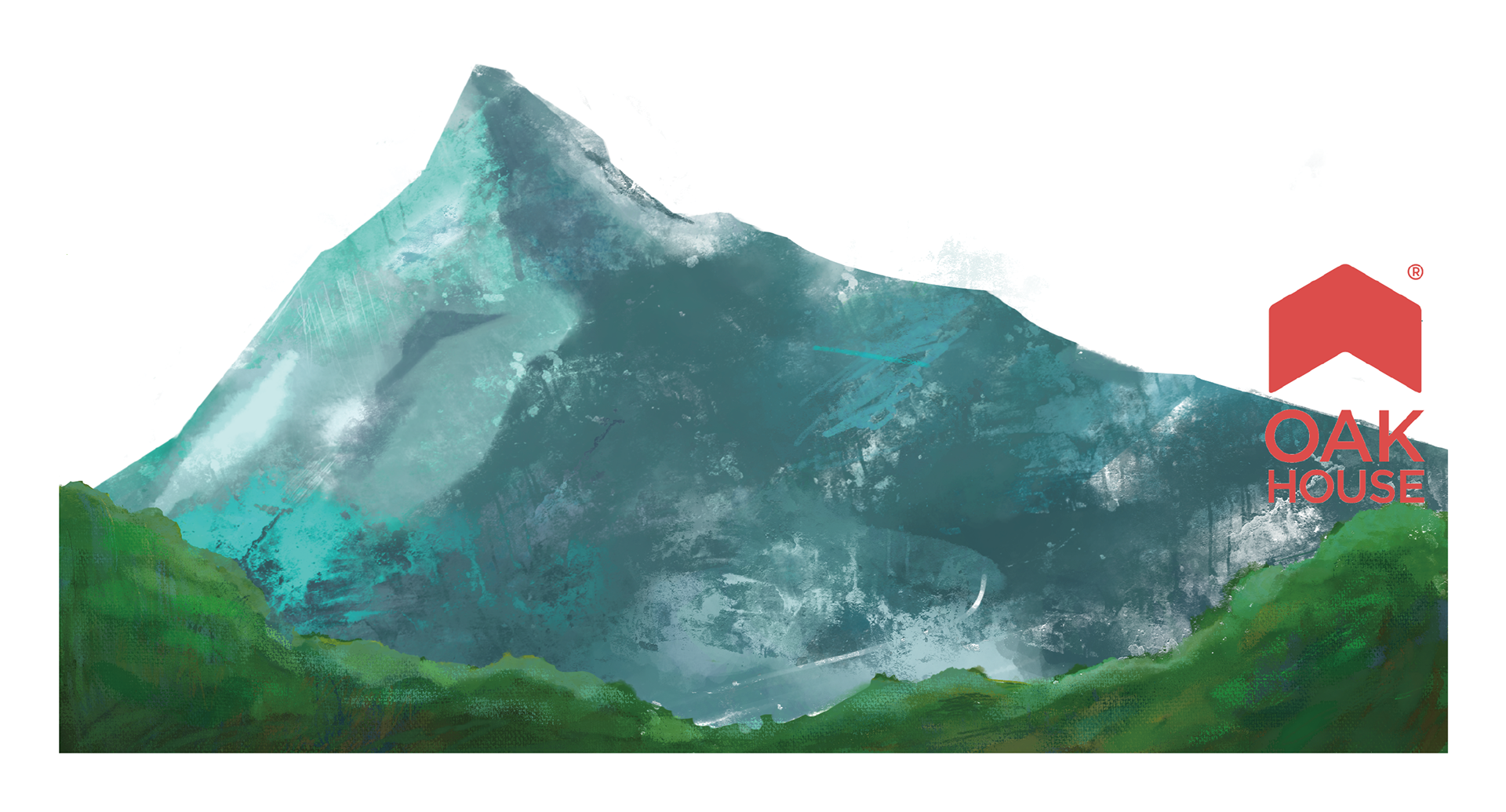
SOCIAL RESIDENCE FUSSA
I designed promotional T-shirts to attract new residents to SOCIAL RESIDENCE FUSSA, a new shared house property launched by OAKHOUSE.
CONCEPT
"Nature in the city"
This property boasts a prime location, just 40 minutes from major stations in central Tokyo, while also offering the appeal of being surrounded by mountains and abundant natural scenery.
PROCESS
In my initial proposal, I created three compositions with mountains as the main motif to emphasize the connection to nature.
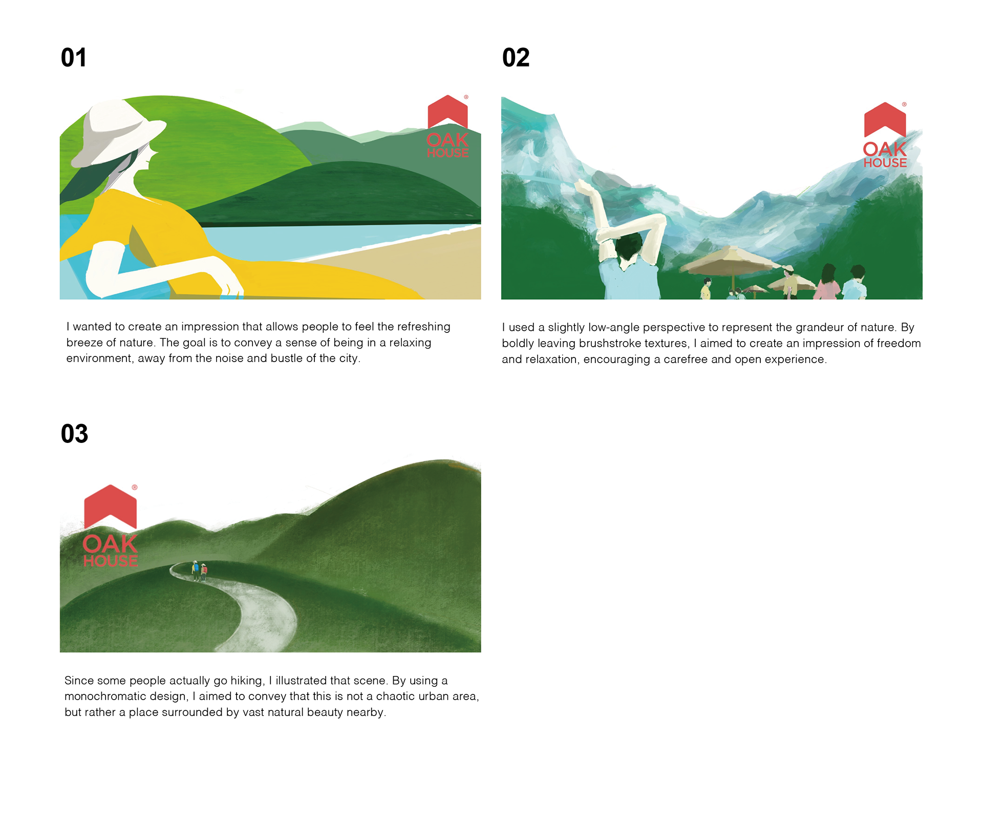
The emerald-green texture of the mountain slopes was well-received, so in the next proposal, I revised the illustration to highlight the grandeur of the mountains' more prominent
In the final design, I adjusted the position of the mountain peaks, added the property’s name below, and finalized the placement of the logo.